case study
calgary city council
Services: Full campaign branding including logo, print, and website design
client overview
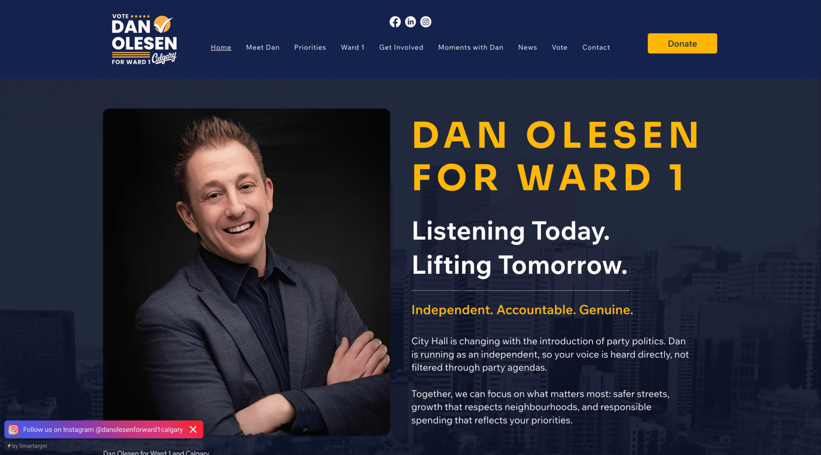
Dan Olesen, a first-time municipal candidate in Calgary’s Ward 1, needed to establish credibility quickly within a short campaign window. With no prior political presence, the goal was to build a cohesive brand system and digital platform that communicated trust, independence, and community-first leadership.
The Challenge
- Launch a full political brand from scratch
- Build instant recognition across digital and physical environments
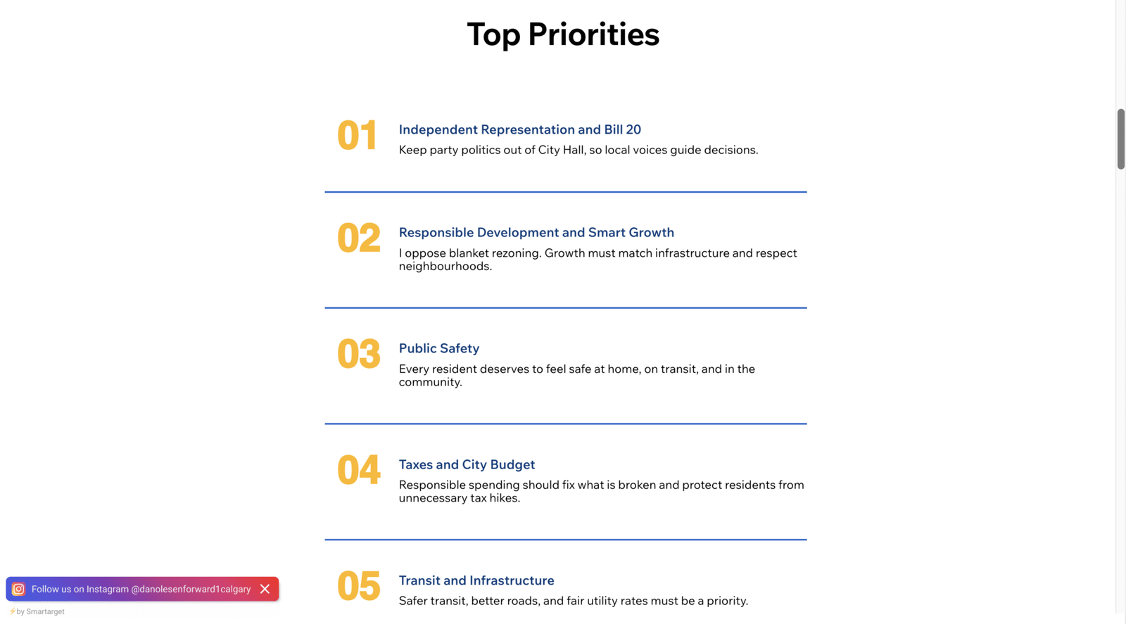
- Communicate complex policy priorities clearly and quickly
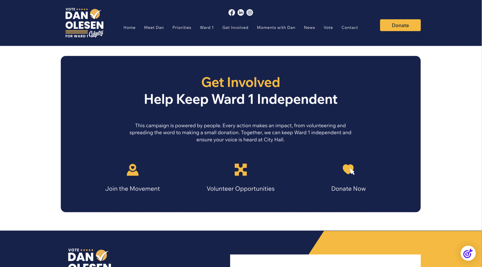
- Drive engagement, donations, and volunteer participation
The campaign required both strategic positioning and rapid execution under tight timelines.
project objective
brand identity
Logo design and complete visual system development.
Visual strategy
Typography and color direction for clear recognition.
design system
Scalable guidelines for consistent cross channel use.
print campaign
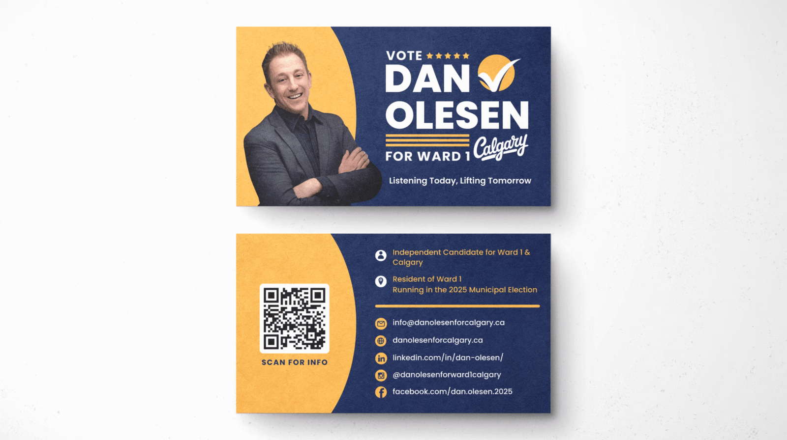
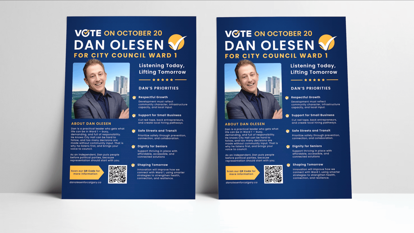
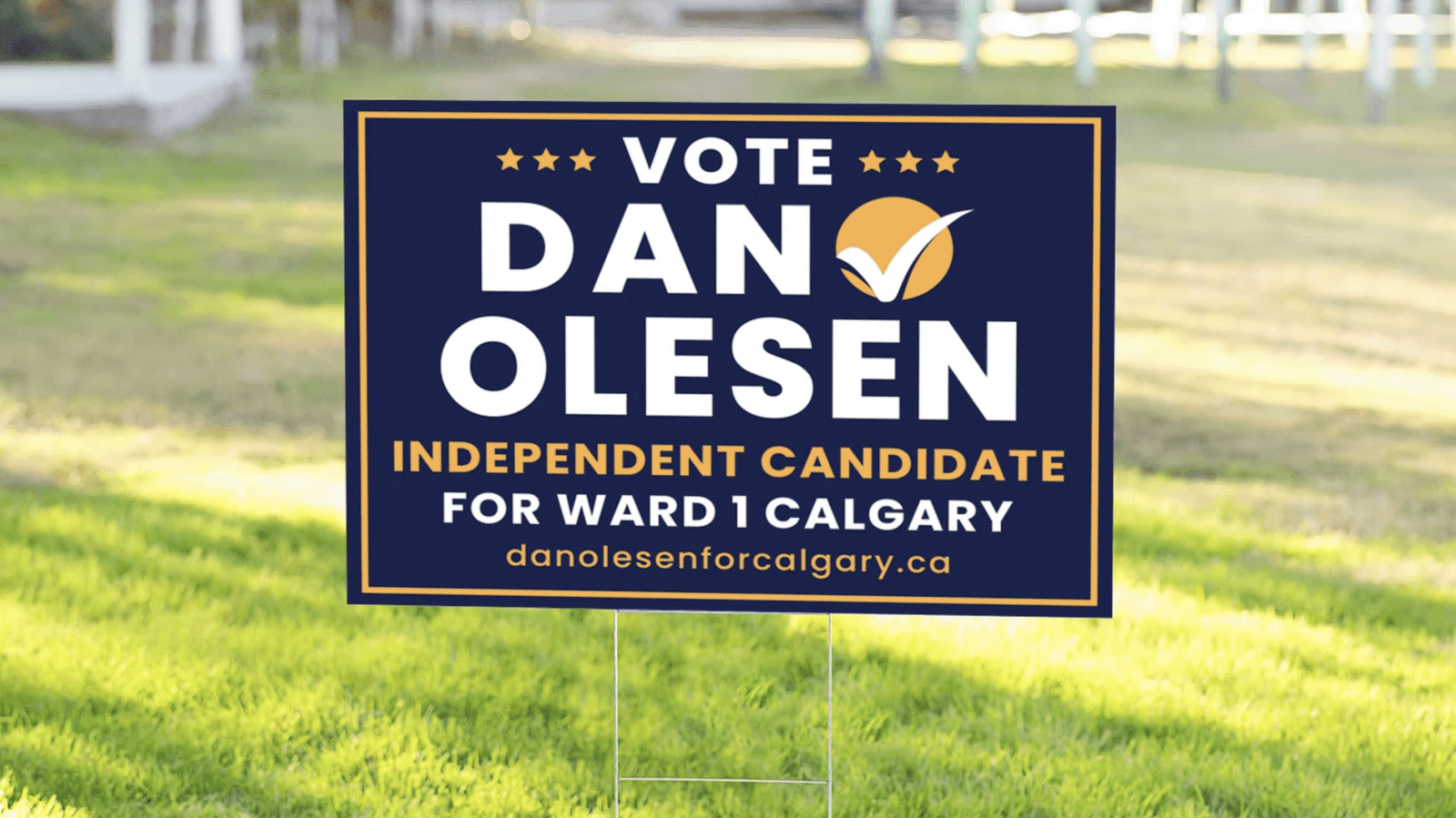
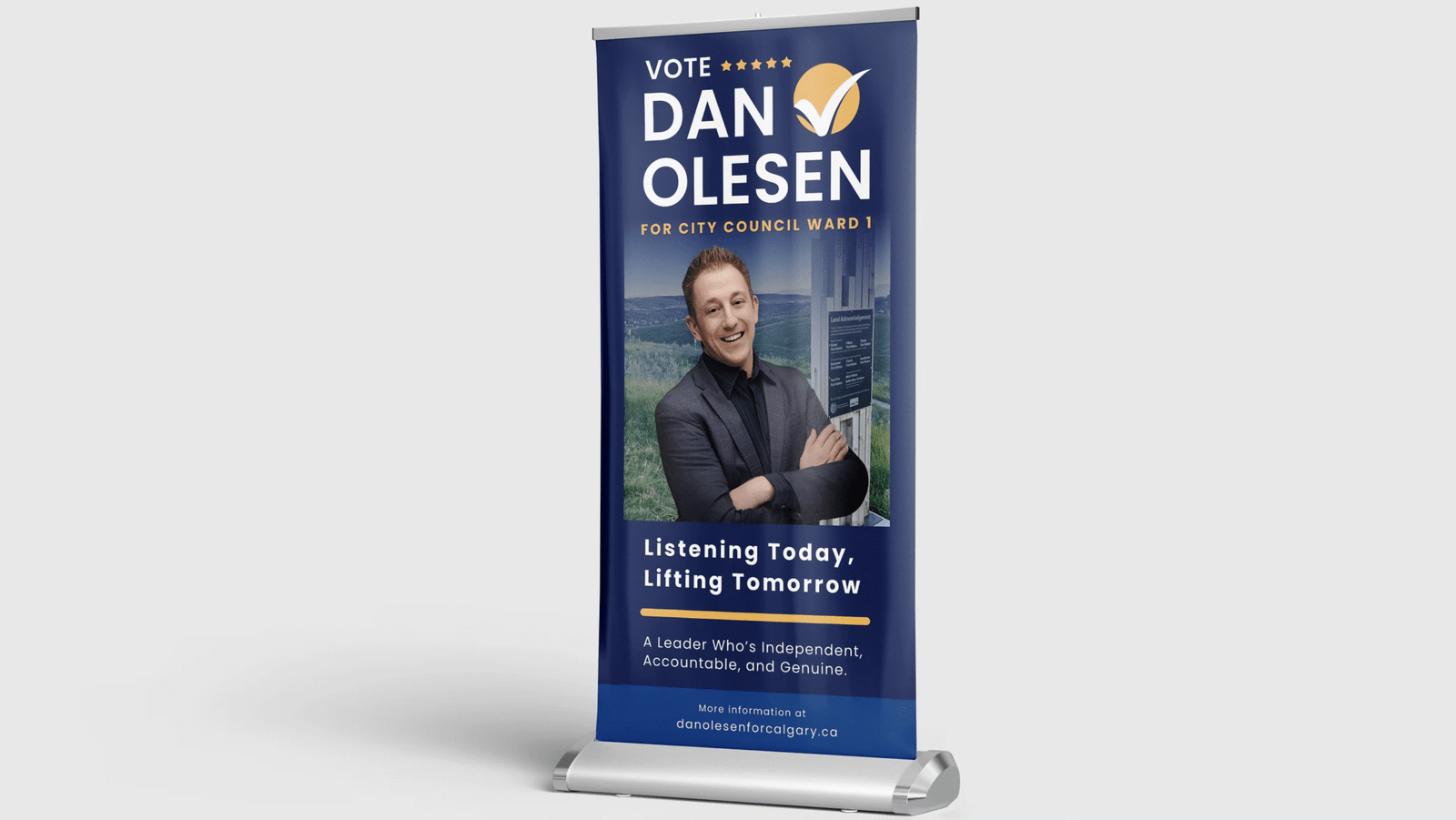
Lawn signs, postcards, and campaign materials.
website and ux
Responsive design focused on clarity and engagement.
conversion flow
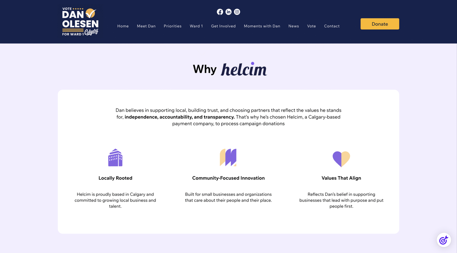
Donation integration and user focused optimization.
STRATEGY and approach
- Built credibility quickly within a limited campaign timeline
- Defined core messaging and values before visual development
- Created a scalable brand system for print and digital platforms
- Structured the website mobile first with clear hierarchy and strong calls to action
- Reduced friction to encourage engagement and participation
- Used performance metrics to validate strategic effectiveness
Brand System Development
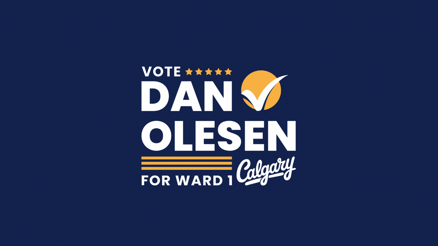
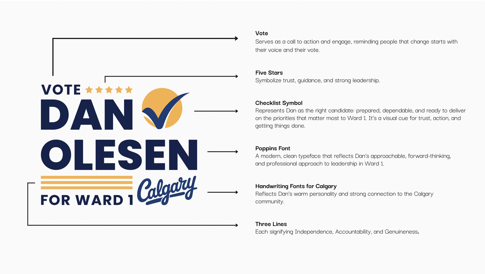
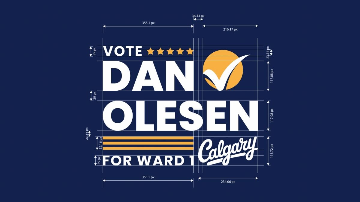
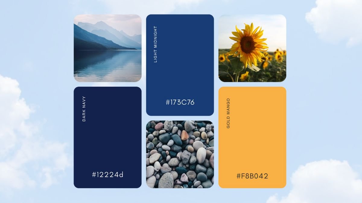
Designed for immediate trust in a competitive political landscape, the system uses bold typography and structured layout for clarity at scale. The check mark and star signal action and leadership, while the navy and gold palette conveys stability and optimism across all campaign touchpoints.


ui/ux focused website
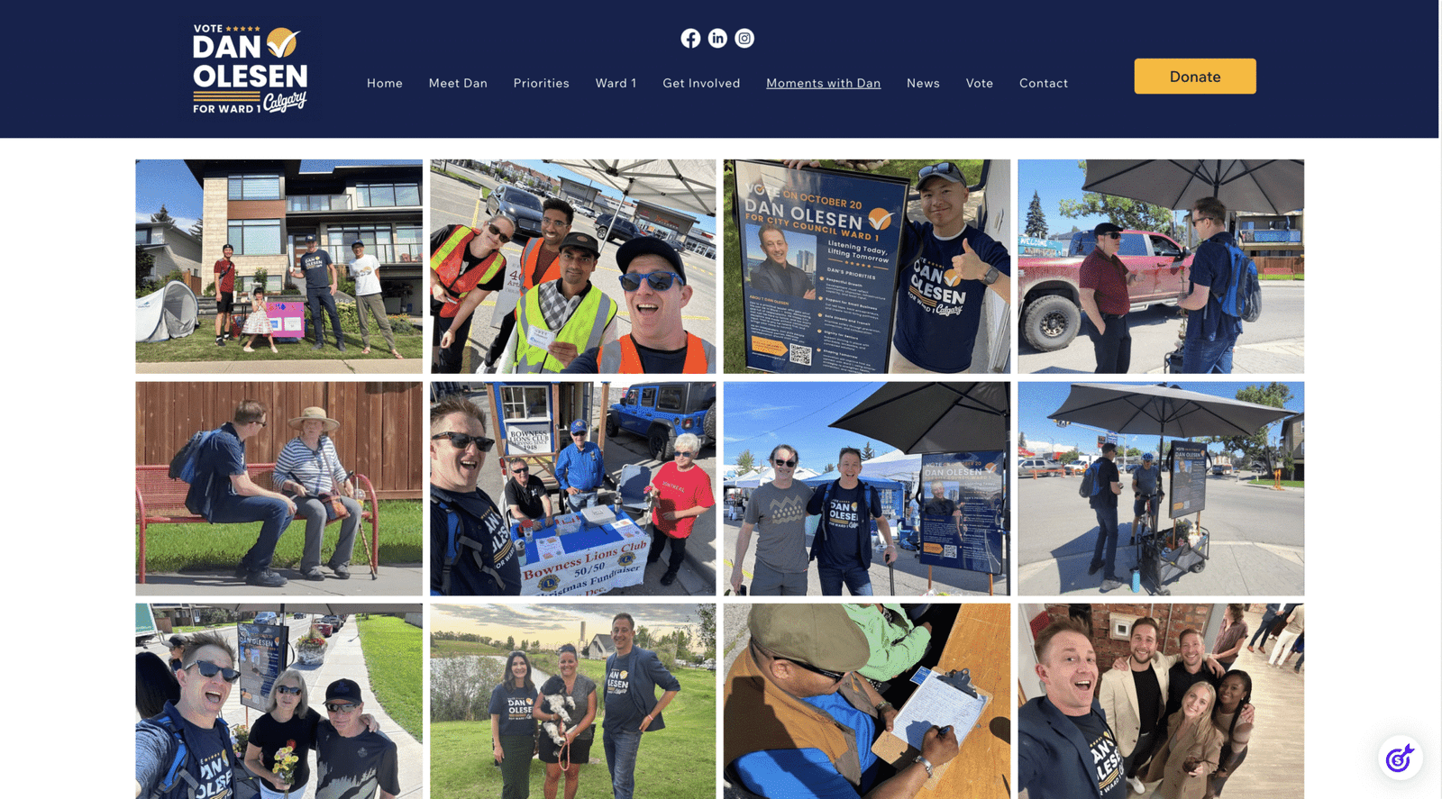
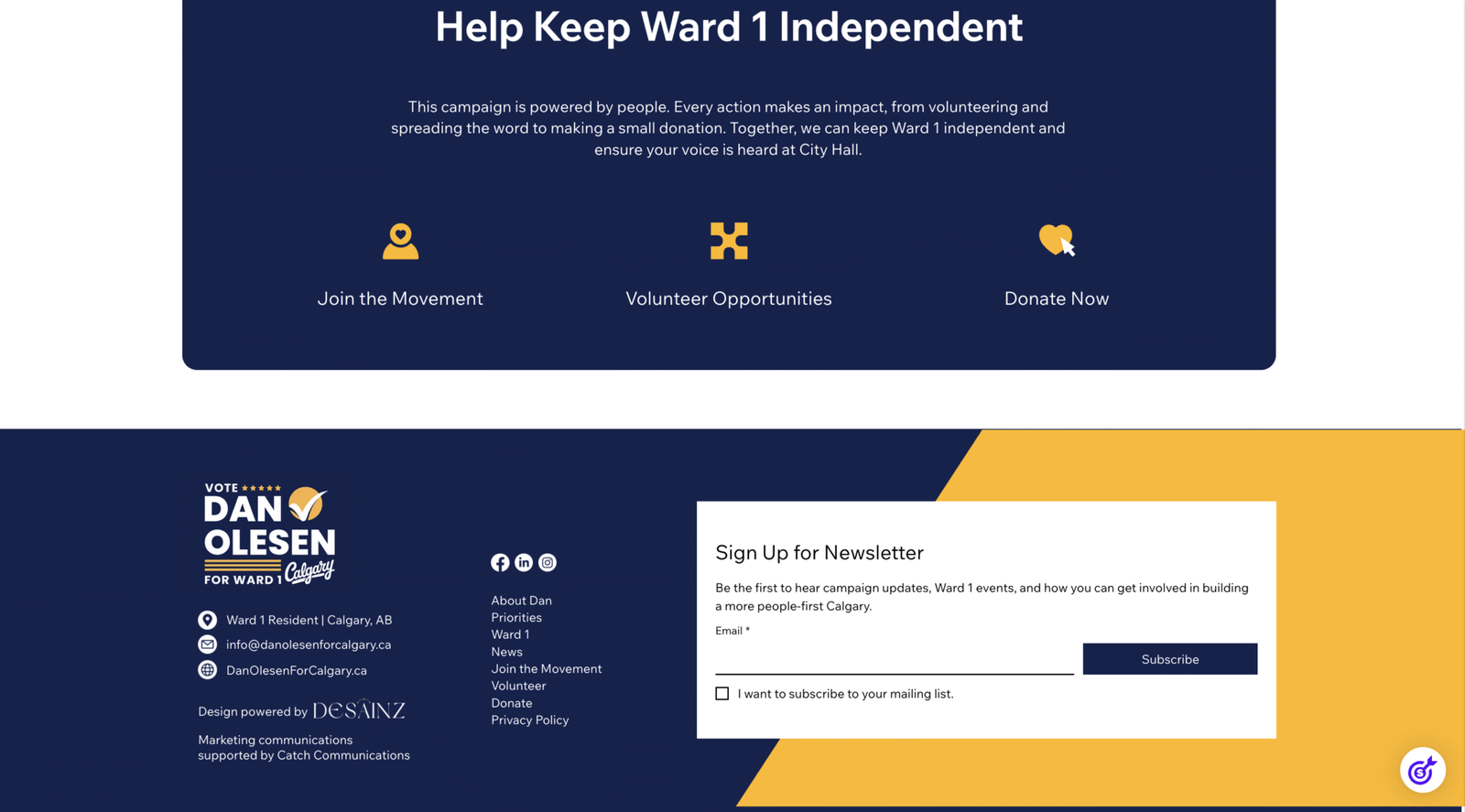
Built with a mobile first, user focused strategy, the site reduces friction by surfacing key priorities below the hero. Consistent calls to action and a streamlined Helcim donation flow support conversions, while community content strengthens authenticity.
Print and Campaign Materials
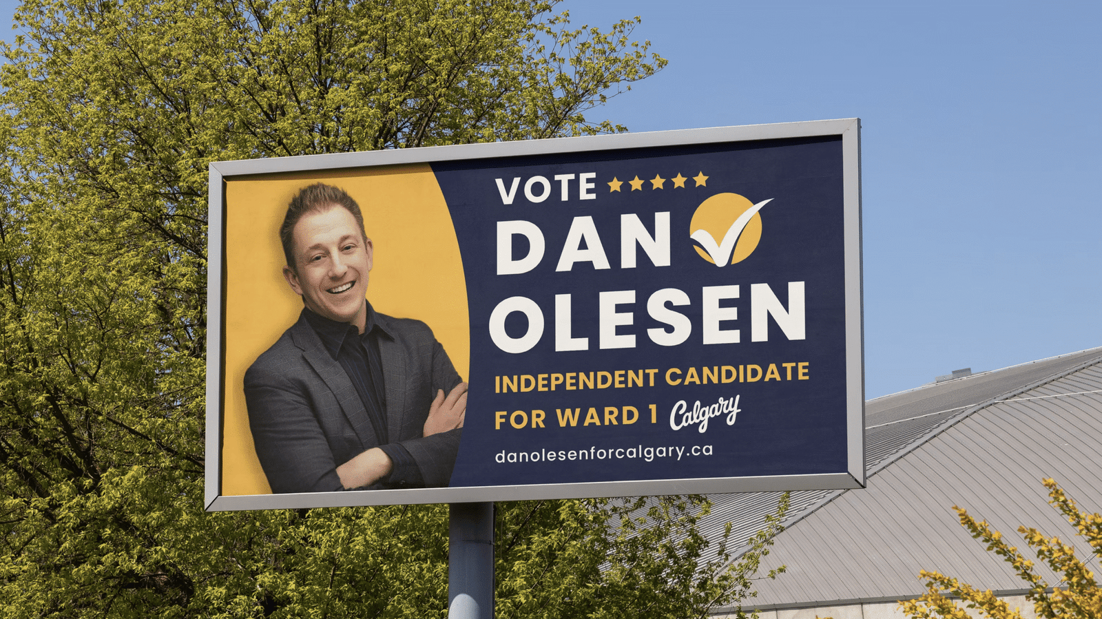
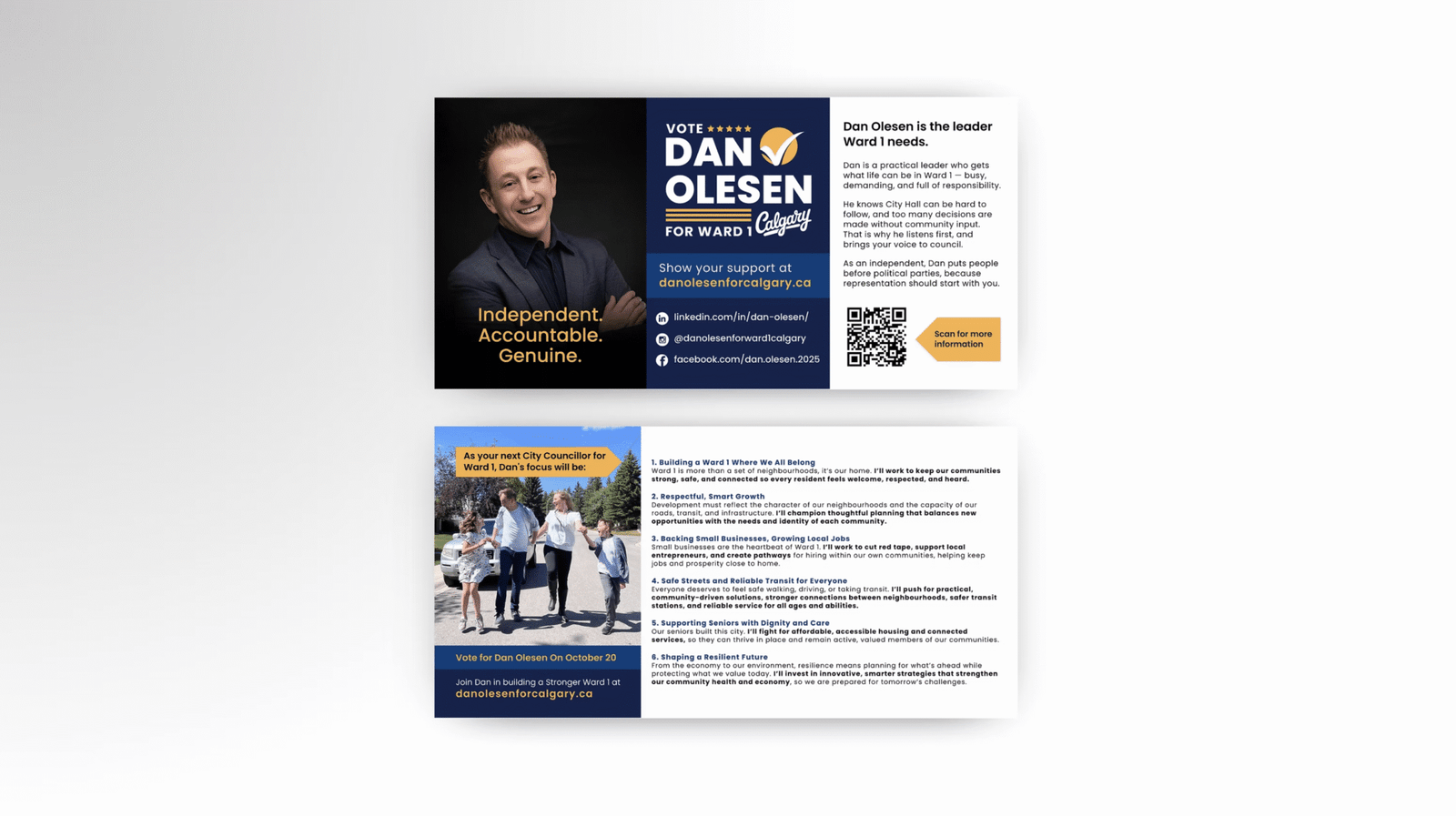
Campaign materials were developed for maximum visibility and instant recognition. From lawn signs to postcards and vertical banners, each piece prioritizes bold hierarchy, strong contrast, and concise messaging to communicate clearly in fast paced public settings while maintaining cohesive brand consistency.
the result
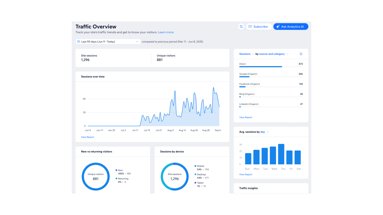
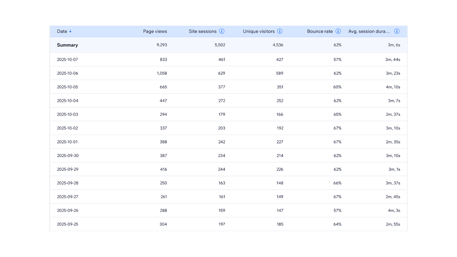
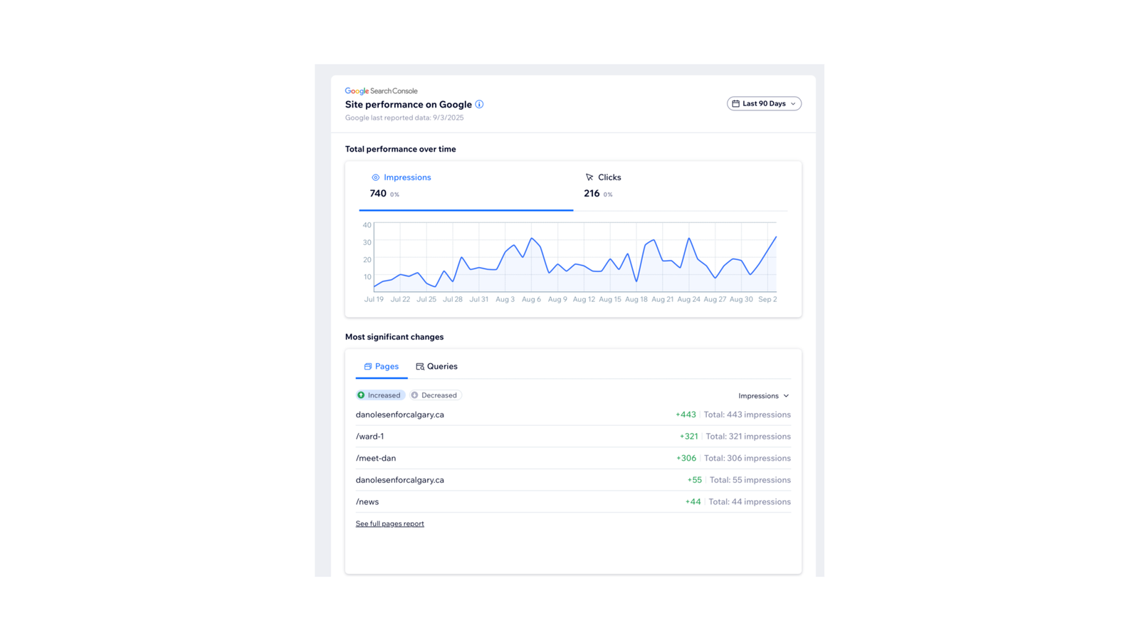
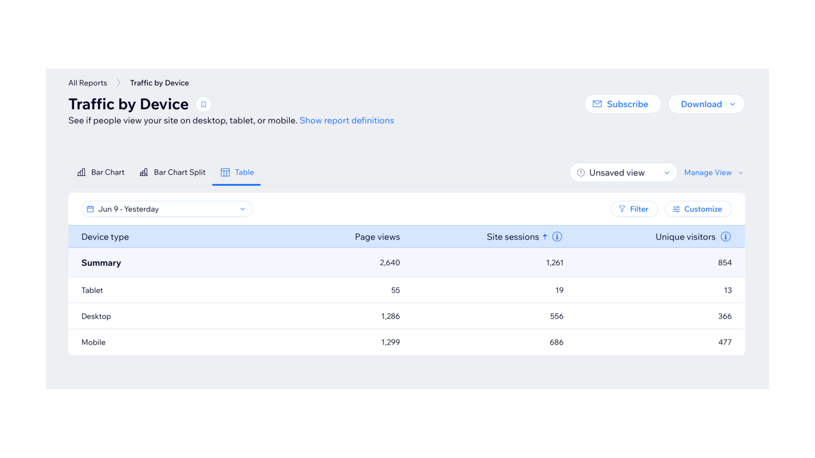
Within a short campaign period, the website achieved:
- 9,000+ page views
- 4,500+ unique visitors
- Average session time over 3 minutes
- Bounce rate under 65 percent
- Traffic came from organic search, direct visits, and social channels.
- Mobile performance accounted for more than half of sessions, validating the mobile first design strategy.
Skills Demonstrated
Political Brand Strategy
Built a credible, community focused visual identity for a first time municipal candidate.
UX Driven Web Design
Designed a clear, mobile first website that helps voters understand priorities quickly.
Campaign Visual System
Created a scalable design system that works seamlessly across print, web, and social.
Human Centered Communication
Translated complex political messaging into warm, approachable visual storytelling.
Cross Channel Consistency
Maintained strong brand recognition across lawn signs, website, and campaign materials.
Collaborative Project Leadership
Worked closely with the candidate and team to deliver aligned results under tight timelines.
