client overview
The Pulse and Perspective Podcast is a health education and storytelling podcast hosted by Dr. Robby Birdi, an emergency room physician. The podcast focuses on sharing real medical stories, practical health insights, and honest perspectives from the front lines of healthcare. The goal is to help listeners feel more informed, empowered, and confident when navigating their own health and the healthcare system.
The Challenge
The original logo lacked clarity, cohesion, and strategic intent. While it referenced medicine, it felt visually busy and did not clearly communicate:
• The podcast format and storytelling aspect
• Dr. Robby’s credibility as a practicing physician
• A sense of trust, clarity, and professionalism
• Flexibility across podcast platforms, website, and marketing materials
The challenge was to create a logo that balanced medical authority with human storytelling, without feeling overly clinical or overly decorative.
project objective
brand identity
Create a credible and modern podcast brand rooted in medical expertise.
MEDICAL FIRST DESIGN
Balance professionalism with warmth and approachability.
FLEXIBLE LOGO SYSTEM
Design a flexible logo system optimized for digital platforms.
brand consistency
Build a cohesive visual identity for consistent brand presence.
STORY LED APPROACH
Translate real medical experience into strong visual storytelling.
LONG TERM GROWTH
Develop a scalable foundation for long term growth.
STRATEGY and approach
- Focused first on how Dr. Robby connects with people, not just his medical practice
- Identified the gap between clinical expertise and public understanding
- Defined the brand around warmth, clarity, and human perspective
- Translated complex emergency medicine topics into relatable, empowering storytelling
- Avoided cold, generic medical visuals in favor of an approachable identity
- Designed a system that builds trust, reduces intimidation, and makes medical knowledge feel accessible
Concept Development
The final logo concept was built by combining three core elements:

microphone
Represents podcasting, voice, communication, and storytelling. It reflects Dr. Robby actively sharing stories and insights with his audience.
Heartbeat Line
Symbolizes life, urgency, and real human experience. It connects directly to the idea of “pulse” while reinforcing authenticity and emotional truth in the stories being told.

Stethoscope
Represents medical expertise, credibility, and Dr. Robby’s role as a physician. The stethoscope form reinforces trust and authority without overpowering the storytelling aspect.
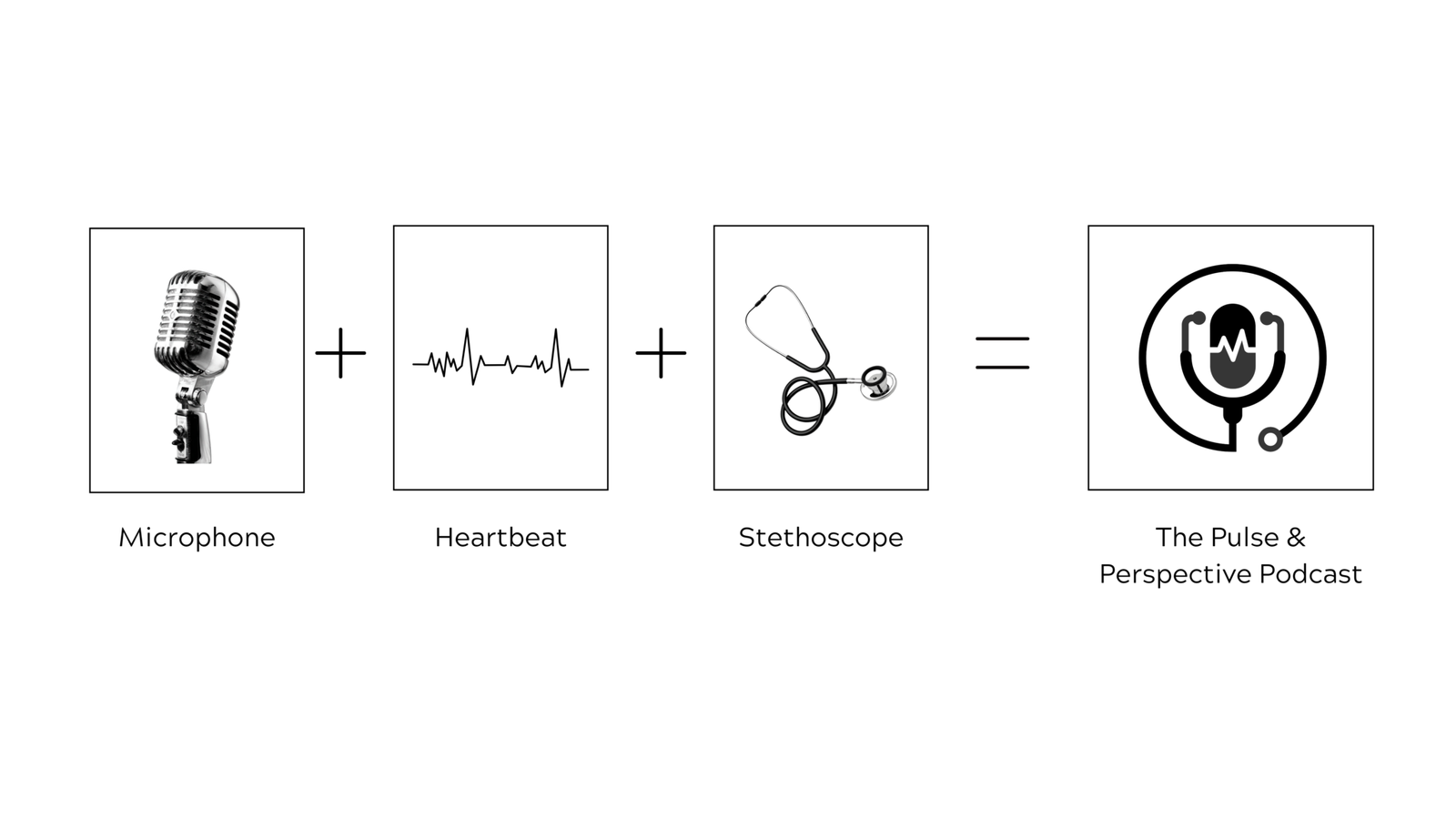
These elements were merged into a single, simplified symbol that feels intentional, modern, and meaningful.
design execution
logo system
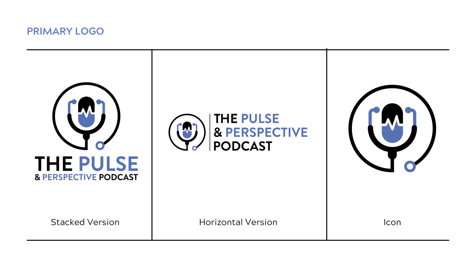
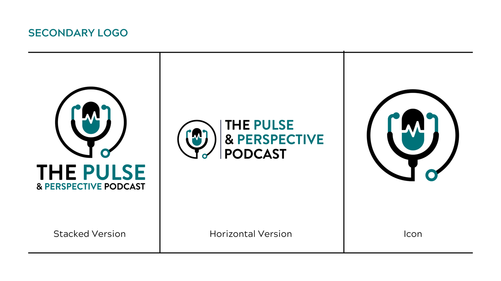
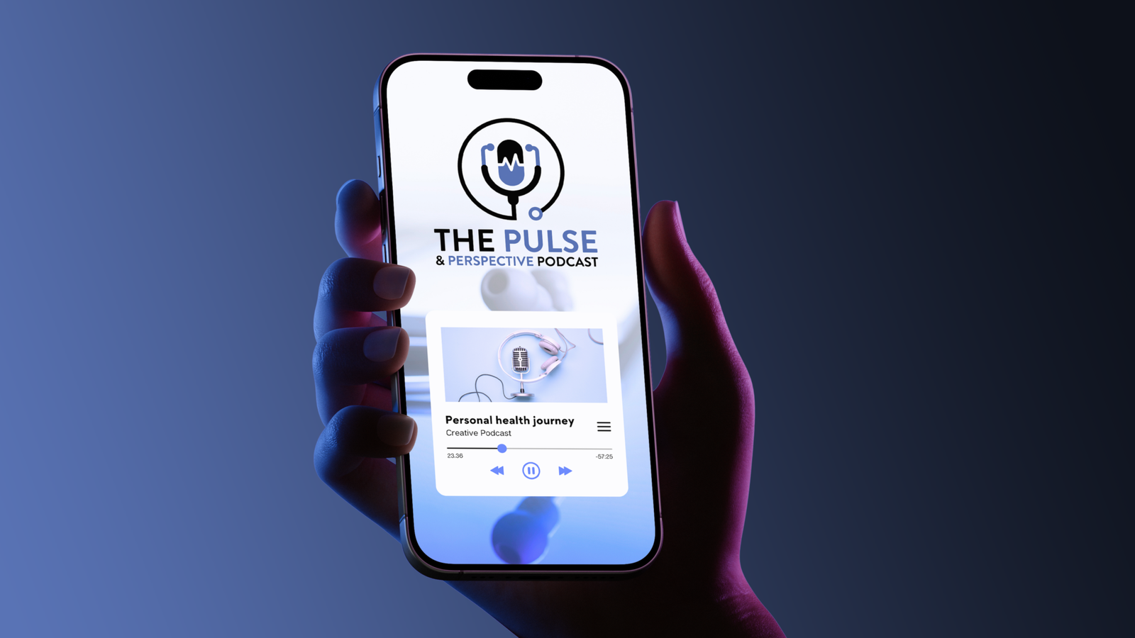
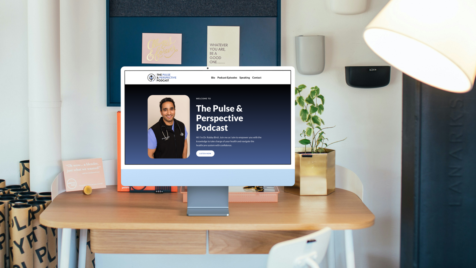
The final logo system was designed for clarity and flexibility. Deliverables included:
• Primary stacked logo
• Secondary horizontal logo
• Standalone icon without text
• Multiple approved color applications
The logo was refined to ensure it remains legible and recognizable at small sizes, particularly on podcast platforms and website.
Color Strategy
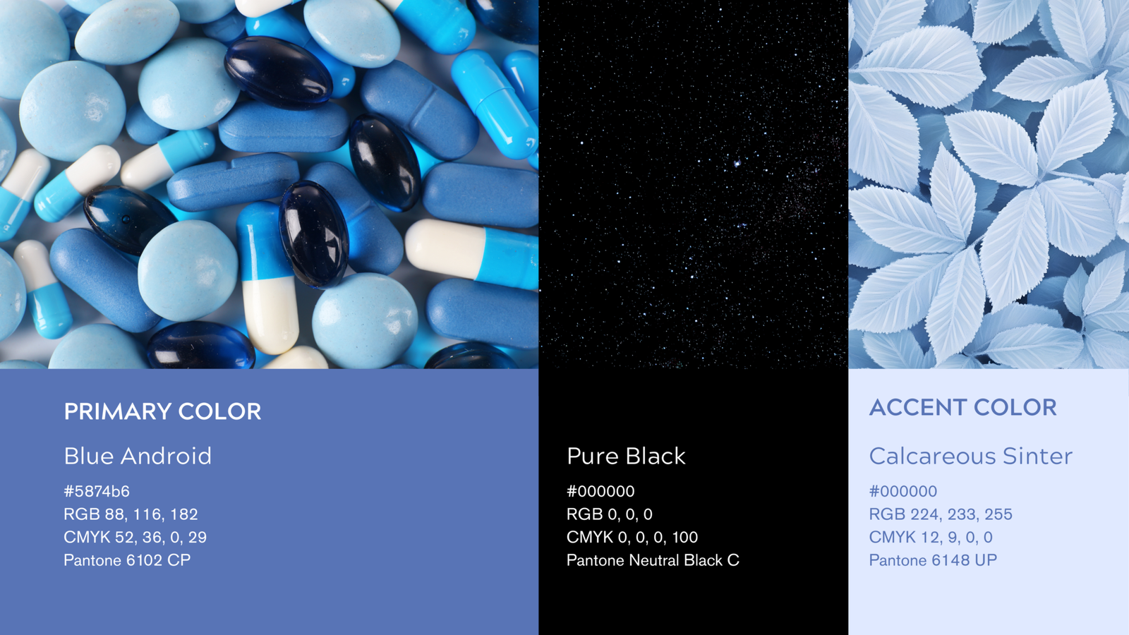
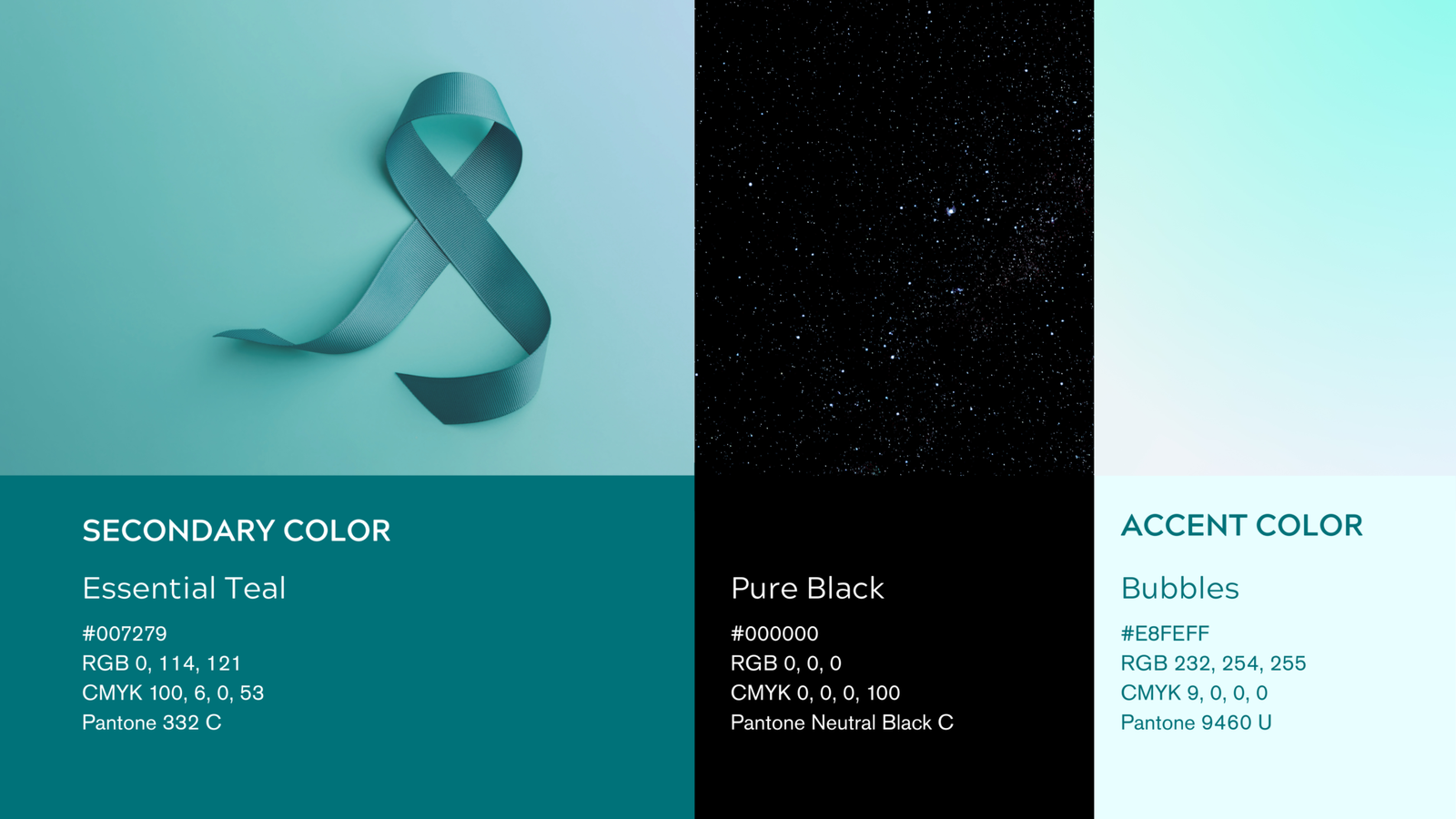
The color palette was inspired by emergency medicine scrub tones to create a subtle but authentic connection to healthcare.
• Primary Blue Android
Represents trust, clarity, professionalism, and calm authority.
• Secondary Essential Teal
Adds warmth and approachability while maintaining credibility.
This balance allows the brand to feel medical yet human, professional yet accessible.
typography
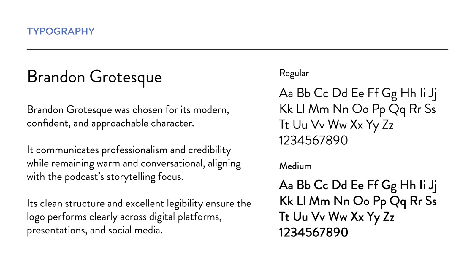
Brandon Grotesque was chosen for its modern, approachable confidence and strong digital readability. It reinforces Dr. Robby’s voice as knowledgeable and credible without feeling intimidating.
outcome
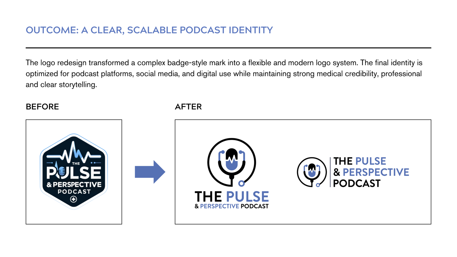
The redesigned logo and brand system successfully transformed the podcast identity into something that feels:
• Trustworthy and professional
• Clearly connected to healthcare
• Story driven and human
• Flexible across platforms
• Ready for long term growth
The final identity gives The Pulse & Perspective Podcast a strong, confident visual presence that reflects both Dr. Robby’s medical expertise and his commitment to educating through storytelling.
Skills Demonstrated
Brand Concept Development
Created a distinctive symbol merging microphone, heartbeat, and stethoscope.
Visual Storytelling
Translated medical credibility and human voice into a clear visual narrative.
Icon Integration
Unified multiple healthcare elements into one cohesive, memorable mark.
Typography and Balance
Crafted clean, modern typography to support clarity and podcast readability.
Scalable Logo System
Built flexible logo variations for podcast platforms, digital media, and print.
Strategic Brand Alignment
Ensured the identity reflects both professional authority and approachable storytelling.
