case study
cloud land calgary
Services: Website design, basic on-page SEO, and interface design
client overview
Cloud Land Calgary is an immersive indoor playground designed for children ages 1–12, combining physical play with interactive projection experiences to support creativity, learning, and family connection.
The goal of this project was to redesign the website to better reflect Cloud Land’s unique positioning as a boutique, sensory-friendly play environment, while improving usability, clarity, and conversion.
The previous website lacked structure, consistency, and clear user flow. The new website focuses on delivering a more intentional, modern, and user-centered experience that aligns with the brand’s core values of calm, creativity, and connection.
The Challenge
- Overloaded pages with too much information in one place
- Lack of clear navigation and content hierarchy
- Weak visual consistency and branding
- Limited emotional connection with users (parents)
- Poor conversion flow for bookings and inquiries
From a user perspective, it felt like: “Too much to process, not clear where to go next”
From a business perspective: The site was not effectively communicating what makes Cloud Land different
project objective
ux strategy
Restructure the website to create a clear, intuitive user journey that guides visitors from discovery to booking.
Visual direction
Refine the overall look and feel to reflect a clean, modern, and family-friendly brand experience.
INFORMATION ARCHITECTURE
Organize content into clear sections to improve readability, navigation, and user understanding.
website and ux
Design a responsive, user-focused website that enhances engagement and simplifies decision-making.
content clarity
Transform dense, overwhelming information into scannable, easy-to-digest content.
conversion flow
Create clear and consistent calls to action to improve bookings and inquiries.
the approach
The redesign focused on three core pillars:
1. Clarity and Structure
Reorganizing content into clear sections and dedicated pages:
- Admissions
- Parties
- Experiences
- FAQ
This allows users to quickly find what they need without feeling overwhelmed.
2. User Experience and Flow
Designing a smoother journey from landing to action:
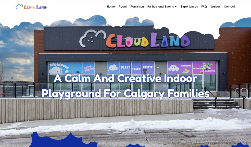
- Clear value proposition on the homepage
- Strategic placement of call-to-action buttons
- Logical content progression (value → details → action)
The goal was to guide users naturally toward: Booking a visit or party
3. Brand Positioning
Shifting the perception from: “Indoor playground”
To: “Thoughtfully designed, immersive family experience”
The messaging now highlights:
- Calm and sensory-friendly environment
- Parent-child connection
- Clean, modern space
- Learning through play
the solution
ux navigation
- Simplified navigation with clear categories
- Improved page hierarchy and structure
- Reduced cognitive load for users
Users can now: Understand, explore, and act within seconds
visual design
- Clean and consistent layout system
- Improved spacing and readability
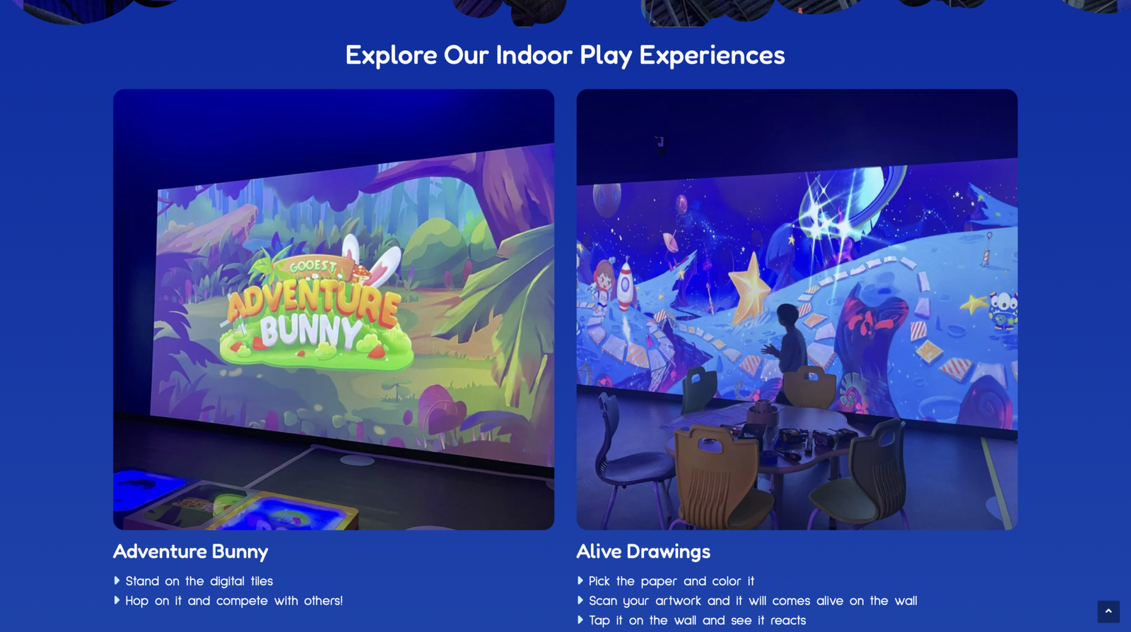
- Stronger use of imagery to showcase the experience
- More cohesive color palette and typography
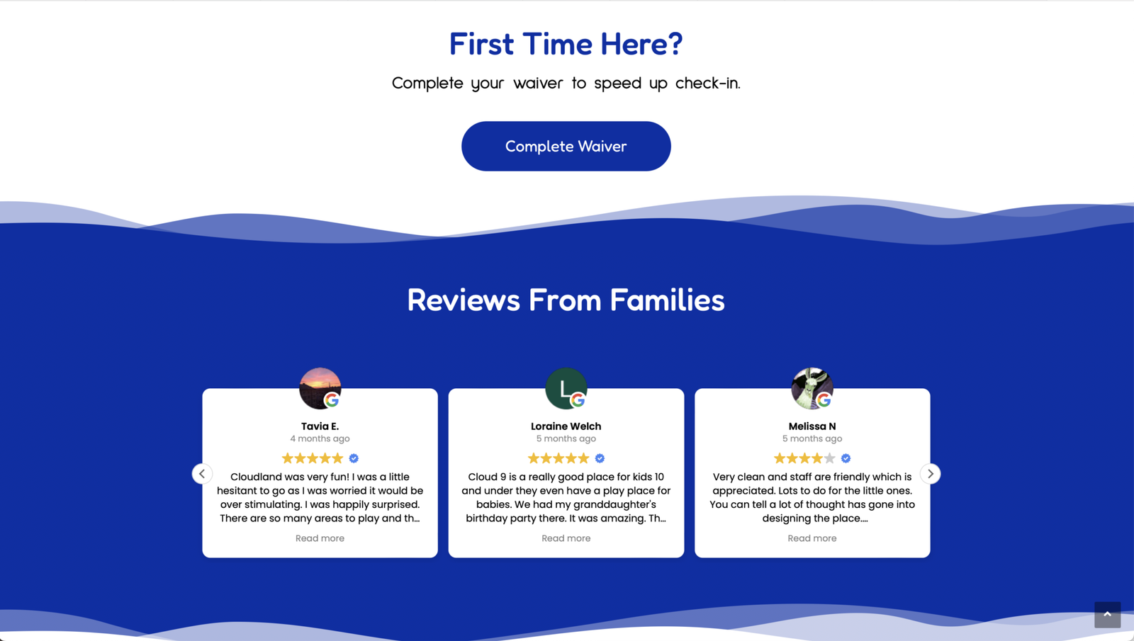
The design feels: More modern, intentional, and trustworthy
content strategy
- Rewritten messaging to be more human and emotional
- Focus on benefits instead of just features
- Clear and scannable content structure
Instead of overwhelming users with details, the content now: Builds interest first, then delivers information
conversion optimization
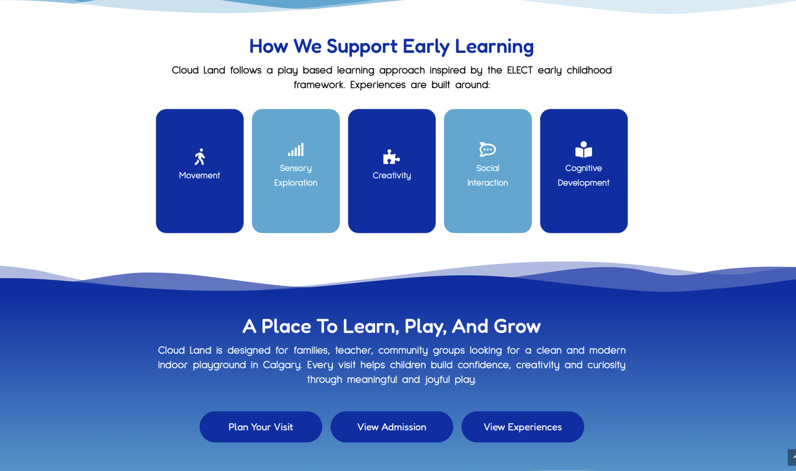
- Clear and repeated CTAs across the site:
- Book Birthday Party
- Plan Your Visit
- View Admission
- Strategic placement of actions throughout the user journey
This improves: Engagement, clarity, and booking potential
key improvement
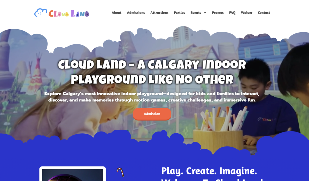
before
- Single CTA limits user action
- Users must scroll to find relevant options (birthday, events, school trips, etc.)
- No clear direction based on user intent
- Over-reliance on one primary action creates friction
- Visual hierarchy is heavy on headline, weak on actions
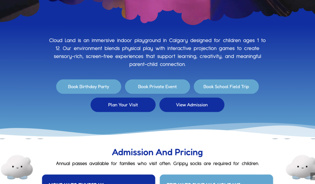
after
- Multiple CTAs support different user goals instantly
- Users can take action immediately without scrolling
- Buttons are grouped and balanced, making scanning effortless
- Clear pathways for key actions
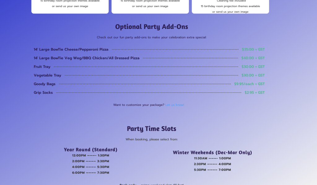
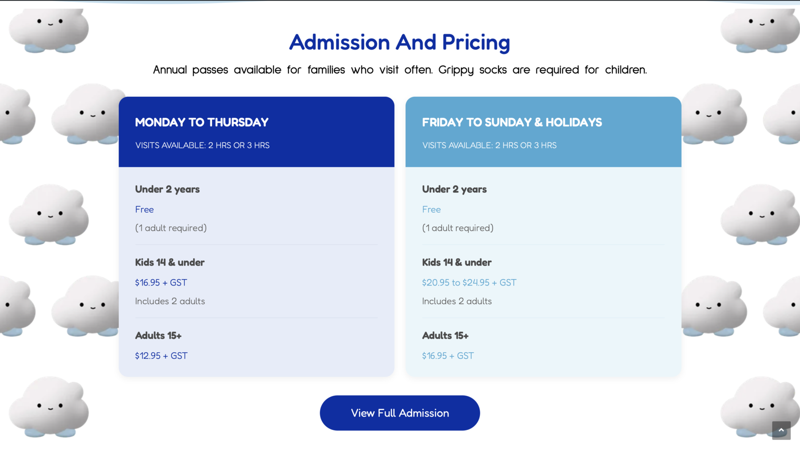
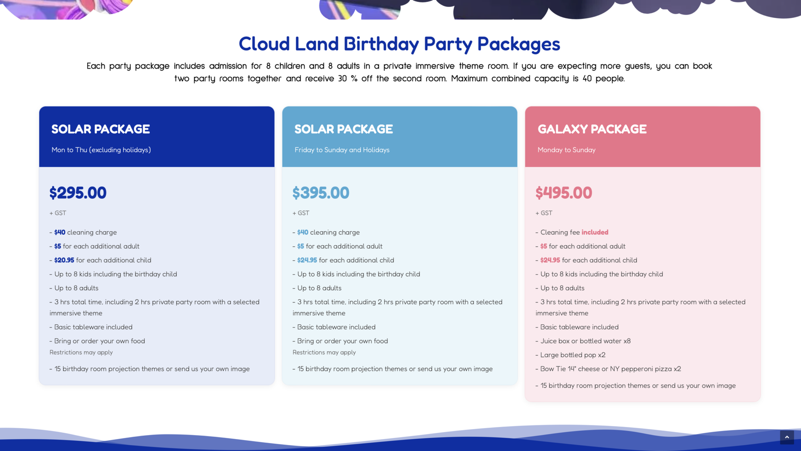
before
- Low contrast between text and gradient background reduces readability
- Font sizes are too small for quick scanning, especially on mobile
- Pricing does not stand out clearly from item descriptions
- Visual elements (colors, lines) create distraction and reduce focus
- Weak hierarchy makes it harder for users to quickly understand information
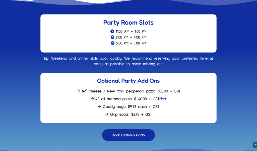
after
- Improved contrast between text and background for better readability
- Increased font sizes for easier scanning across all devices
- Clear emphasis on pricing to support quick decision-making
- Use of icons to enhance visual clarity and support quick understanding
- Stronger hierarchy to guide users through information efficiently
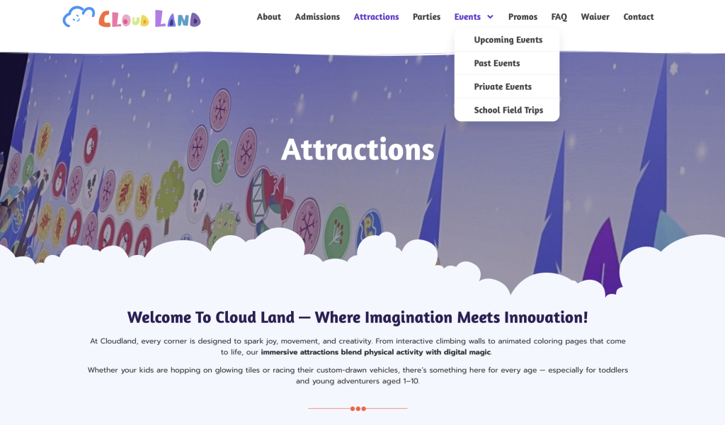
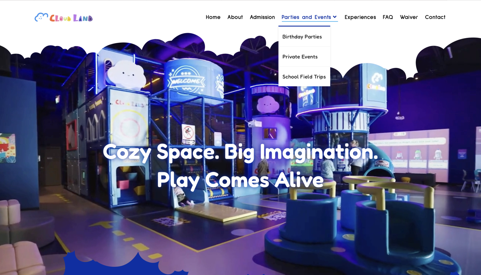
before
- Unclear navigation labels create confusion for users
- Key offering like birthday parties is not immediately visible
- Mixed content in dropdown disrupts user flow
- Lack of structure forces users to search and guess
- Weak hierarchy reduces usability and clarity
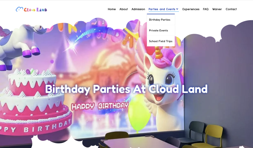
After
- Clear and intuitive navigation aligned with user intent
- Dedicated pages for each party and event type
- Structured dropdown improves discoverability
- Users can quickly navigate with confidence
- Strong hierarchy enhances usability and experience
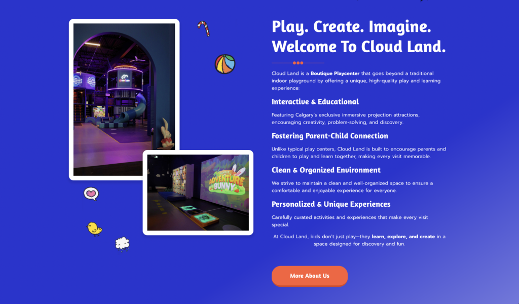
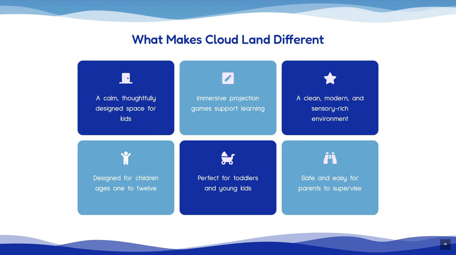
before
- Too many visual elements create a busy and overwhelming layout
- Inconsistent alignment reduces structure and visual balance
- Content and visuals compete for attention instead of working together
- Layout lacks structure and breathing space
- Overall experience feels busy and less refined
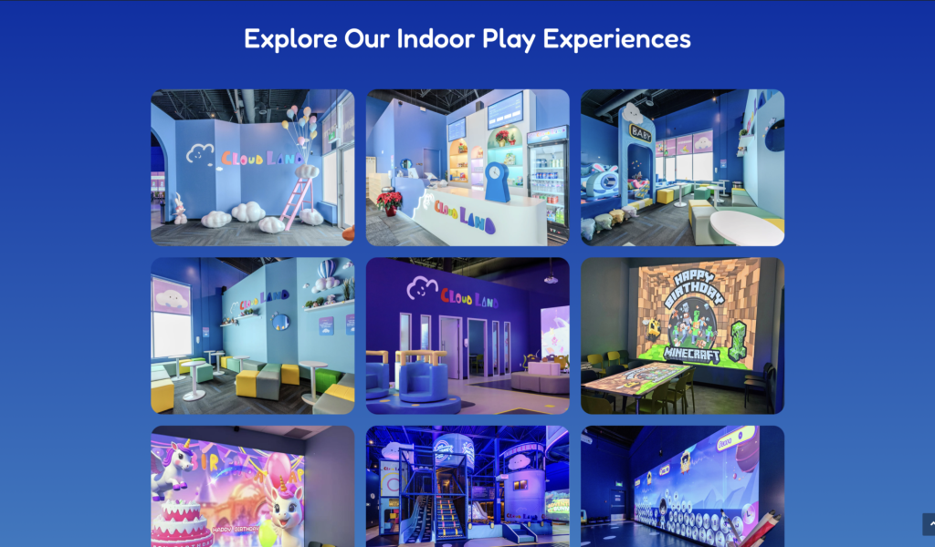
after
- Clean layout allows visuals to stand out and tell the story
- Structured grid system improves organization and flow
- Clear separation between content and imagery enhances readability
- Visual hierarchy guides users naturally through the page
- Overall design feels modern, premium, and experience-driven
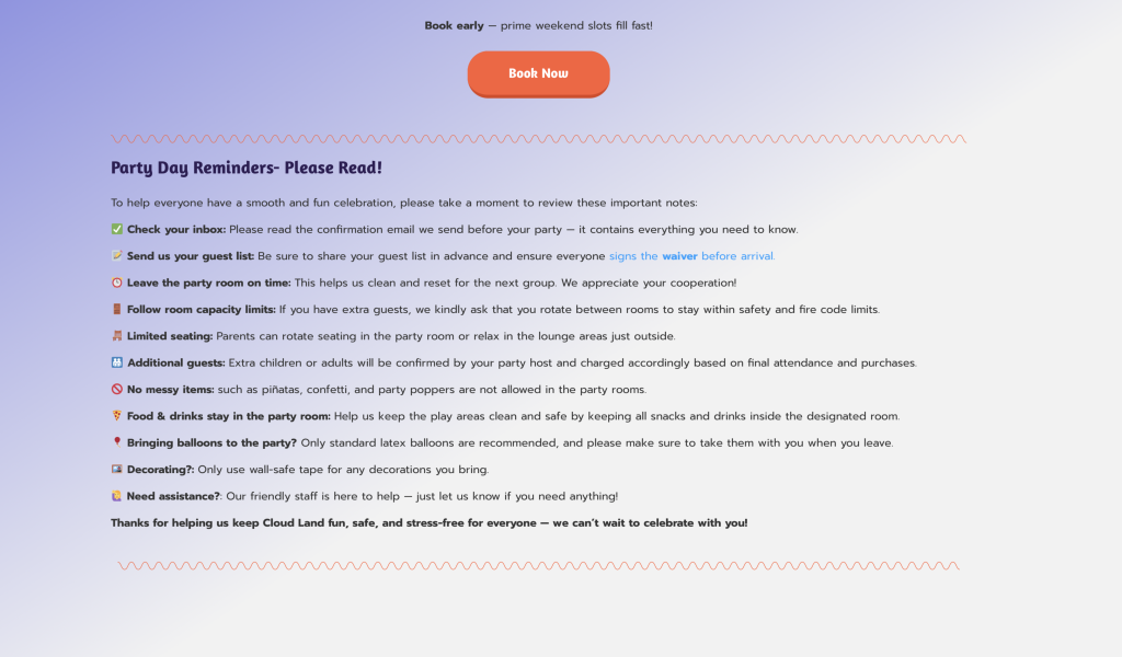
before
- Information is presented as a long block of text
- No clear structure or step-by-step guidance
- Users must read everything to understand the process
- Booking process is unclear, users often need to send an email to ask how it works
- Important actions are buried within paragraphs
- Creates friction and delays in decision making
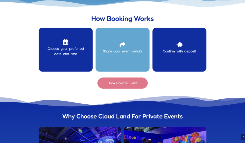
after
- Booking process broken into clear, interactive steps
- Flip cards reveal details on interaction, keeping the layout clean while still informative
- Users see the big picture first, then explore details only when needed
- Strong visual hierarchy makes each step easy to understand
- Interaction adds engagement without overwhelming the user
- Clear CTA guides users directly to booking
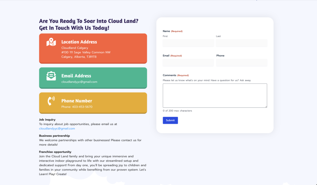
before
- Multiple strong colours competing for attention
- Overuse of bright blocks creates visual noise
- Footer feels heavy instead of supportive
- Contact details are highlighted individually instead of as a system
- Hard for users to quickly scan or focus on key information
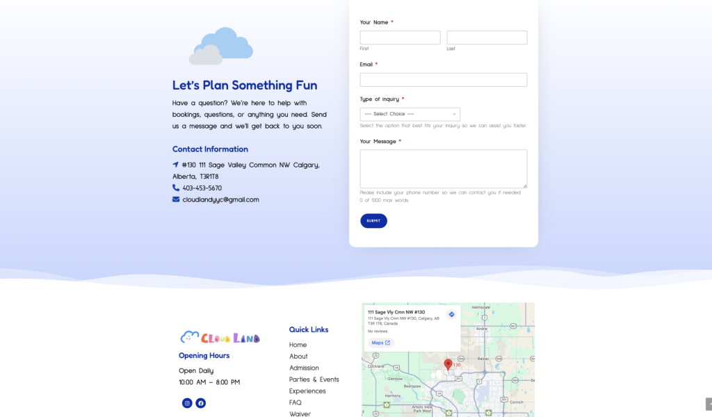
after
- Minimal and controlled colour palette improves focus
- Clear hierarchy guides users to the most important information
- Contact details are grouped and structured for easy scanning
- Footer becomes clean and supportive, not distracting
- Map integration highlights the most important action, finding the location
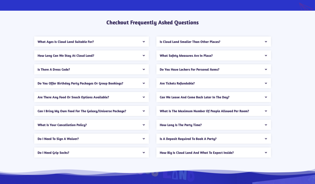
before
- All questions presented in one long, unstructured list
- No clear grouping or categorization of content
- Users need to open multiple items to find relevant answers
- Hard to quickly locate specific information
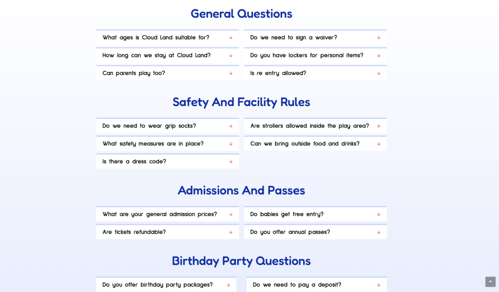
after
- Questions organized into clear categories for easier navigation
- Structured layout helps users find answers faster
- Strong visual hierarchy separates sections and improves clarity
- Reduced cognitive load by grouping related content
- Users can quickly scan and go directly to what they need
the result
The new website better reflects Cloud Land’s identity as a premium, immersive play experience rather than a typical indoor playground.
Key outcomes include:
- Improved user clarity and navigation
- Stronger brand positioning and differentiation
- Enhanced trust and credibility for parents
- More intuitive booking and inquiry flow
Most importantly, the website now communicates what Cloud Land truly offers:
A calm, creative, and meaningful space where families can connect through play